The Client
The Kitchenarium creates healthy recipes for busy families. It is ran and operated by Jamie, who has been featured in many different magazines as well. Her inspiration was to keep an online recipe box of recipes her family loves and to try new things.
The Need
Jamie needed a simple and clean but identifiable mark that would reflect her love of the bright colors that appear on vintage pyrex of the 50’s. It was important to her that the logo be vintage but clean. She wanted her readers to feel relaxed, impressed, excited and inspired.
In addition to the logo, she also needed a website that would reflect the same emotions while allowing her to feature recipes and blog posts. The website would need to be responsive and built on WordPress to manage the recipes and posts. She wanted to keep things simple but accessible.
The Solution
We explored several different routes for the logo but ultimately landed on the final option because it reflected the rounded lines often found on pyrex and common colors from that time period. The mark had a vintage theme while still staying clean and neat. To compliment the mark, we also included a handful of patterns also commonly found on pyrex dishes.
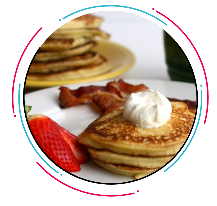
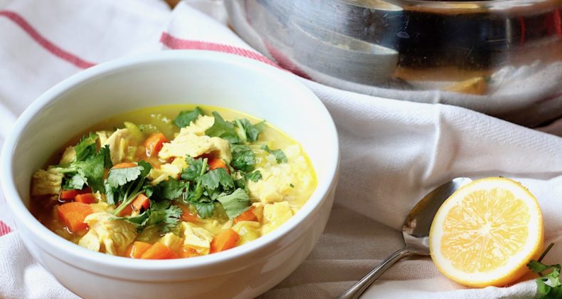
It was important to keep the website clean and white while adding the pop of vintage colors. Photography was also a big priority for the website. People connect with photos better than just words.
The Team
Alex Gates
- WordPress Development
- Project management
Becca Kroese
- Identity Design
- Front-end development
Hannah Tripe
- Responsive Design
- User Interface Design